DIY Modern Farmhouse Living Room Makeover
First off, let me start by saying - I am not , nor will ever be a professional Interior Designer. Although, at this point, I feel as if I’ve digested (+ invested in) enough books , magazines, articles and how-to video content to probably say I could have some kind of unqualified amateur certificate in the field. Regardless, I’ve always believed that you should listen to your gut and design with your heart. General “design rules” are important to find symmetry and balance in a room, but don’t take it too seriously - design should be fun! As long as you’re happy with the outcome, who cares what anyone else thinks. This is the approach I take with any room I create makeovers for.
Design with your heart first - then apply the rules second.
Before we dive into the nitty gritty of this makeover, let’s first talk about where the living room started - I feel like it’s important that I share this because it reveals that literally ANY SPACE has potential with the right attitude and elbow grease.
The walls were a dark blue/grey, the furniture and general decor was mismatched, there was a lot of faux-fur texture happening (wtf lol), and a rug that was clearly too small - Basically, this room became the “I just moved in, we own too much stuff dumping ground”.
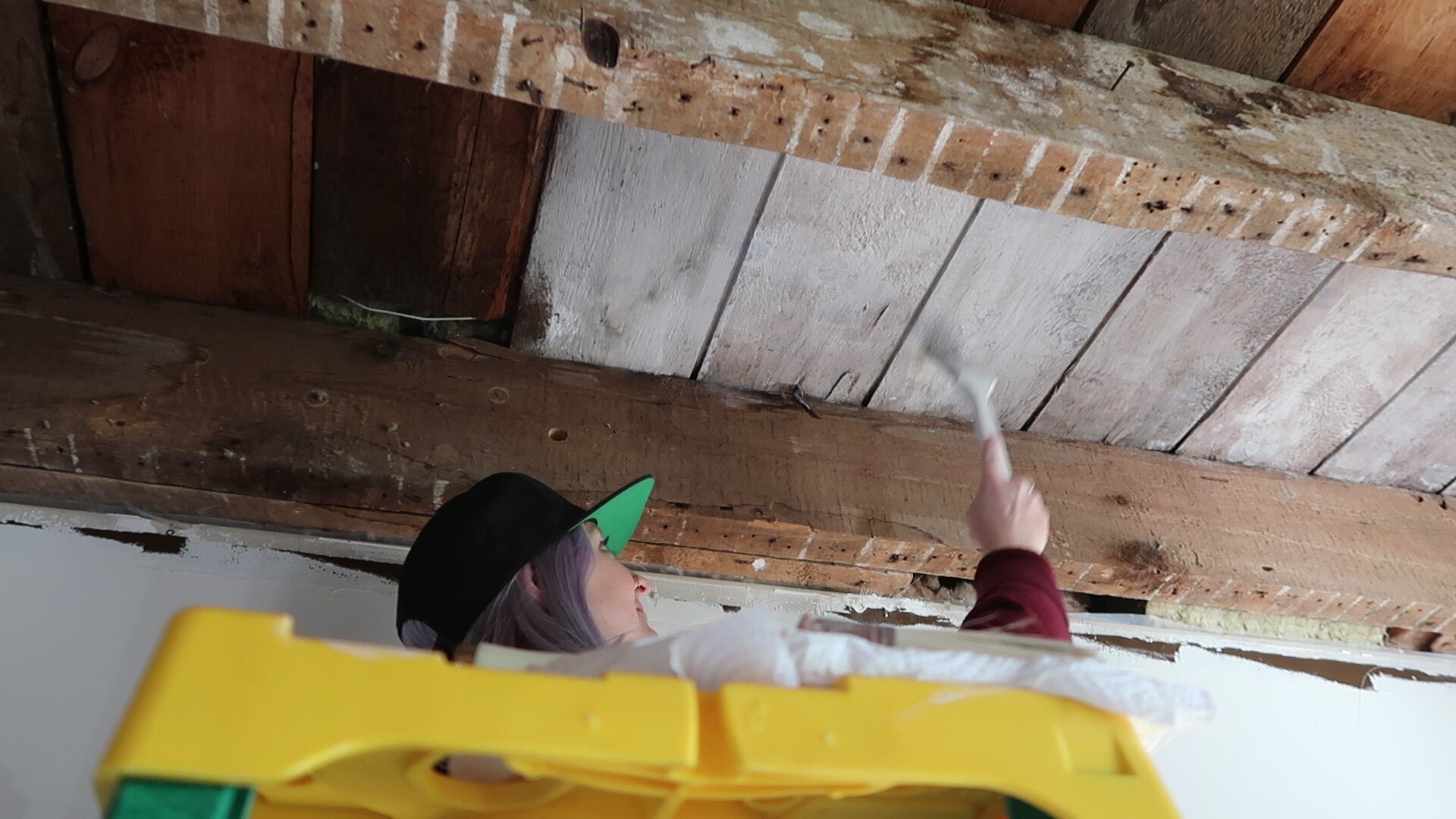
The only true redeeming quality of this space was the open ceiling, revealing the exposed wood beams that my partner and I worked hard to bring down. It was a solid 6 hour journey on a Saturday, but the ceiling came down and it was soooo worth it. These 150+ year old beams were absolutely beautiful and set the stage for the rest of the design. 😍
If you want to see that video, you can watch it HERE.
THE MOOD BOARD
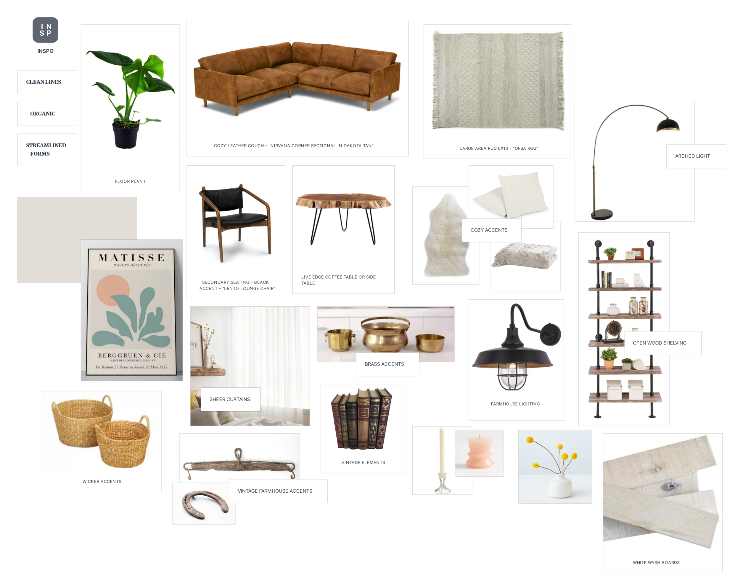
If you’re ever in a situation where you can’t seem to figure out your style or direction in a space, always create a mood board to get you started. Pull in items you love, photos of different living room spaces that you enjoy, art pieces you like etc. You’ll begin to see elements within this mish-mosh of photos that can help you determine what you want in your space. For me, I was looking for cozy textiles, brass accents, vintage + farmhouse features, industrial matte black highlights, live edge wood + warm colour tones. I went for a warm white on the walls and a rich caramel brown with the couch. Looking at all these elements on a mood board helped me determine my design direction and reveal that it had a cohesive look.
THE DIY JOURNEY
This DIY adventure was literally no joke. It was the longest 6 days of my life and at points I felt like I might not make it. Looking back, I guess everyone needs to experience a “Mordor” like journey - where Frodo (ME) goes on the epic world-saving journey to Mordor to destroy the one ring of power. Except the ring was my arm and yes… it was destroyed.
Also, I had no fellowship…just a dog. Needless to say, he was pretty useless.
It took 6 days in total to complete this project. 1 Day to prep and paint. 2.5 days to paint the ceiling (mordor) and sand the beams, 1 day to add trim + detailing, 1 day to add fixtures and shelves etc. and 1 day to add all the final details. Phew!
Was it worth it though? Oh yeah.
THE FINAL DESIGN
Welcome to my Modern Farmhouse Living Room! Not to toot my own horn here but I think I nailed my vision and the entire space felt exactly as I hoped; warm and inviting! The whitewashed ceilings made the room feel larger + brighter and the cozy knit rug grounded the space, making the room feel super cozy. Second to that, the casual nature of the creamy leather couch stole the show, allowing the space to look lived in and warm. Scroll down to see all the elements that went into the space!
SHOP THE LOOK!
The Nirvana Dakota Tan Leather Couch was exactly how Article called it… NIRVANA. Basically, I just sat down in it and never got up. I’m still there now… sitting on it while I write this to you. I wont get up. YOU CAN’T MAKE ME.
This Gorgeous Corner sectional is literally the most comfortable couch I've ever been on. The qualities I most love about this couch is the soft leather, down-filled cushions and the distressed furniture. I wanted something that could hold up, no matter the marks, wrinkles and creases that are put on it. These would simply add to the personality and uniqueness of the couch. It’s kind of like a leather jacket, the more you wear it, the better it looks. Gives it a lived-in look you know? It’s my dream.
This is the Lento Lounge Chair by Article. This chair is made from solid, walnut stained wood. This chair was not only sexy, it's so friggin comfortable. It has a foam padded seat and durable buffalo leather upholstery. That sounds so bougie and I’m here for it. Basically sitting in this chair makes me feel very debonair. It’s just a seductive chair. It calls me to sit in it and I love that about it. I want to sit in it and have long deep conversations about the wonders of the world in it. I don't know how else to describe it so we're going with that. Cool.
People are constantly asking me how it cleans… not sure why, but I figured I would add it here anyways because maybe you want to know too? The chair cleans REALLY well. I wipe it down once a week with my swiffer cloth and it all seems to be holding up really well.
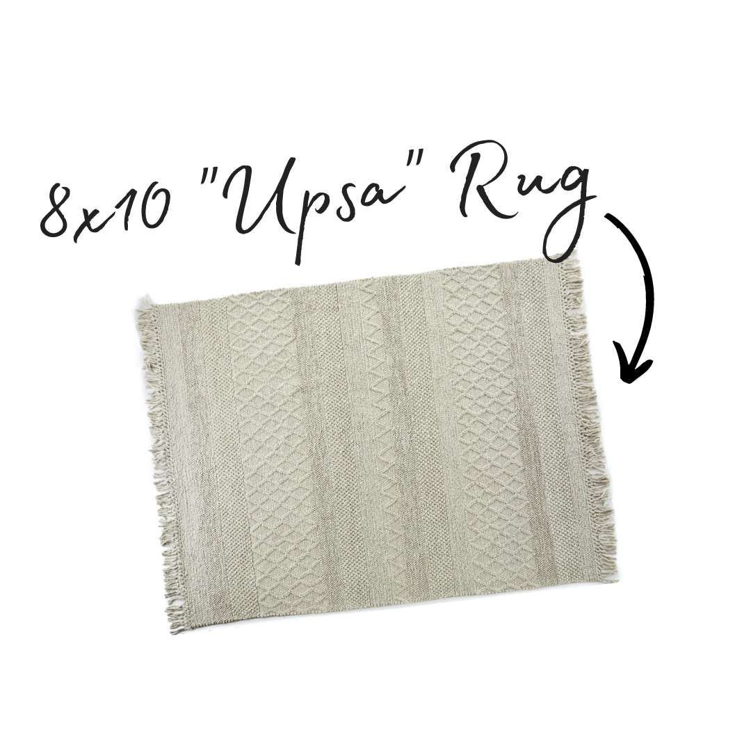
This is the 8x10 UPSA Rug. The most beautiful and literally the most comfortable rug I’ve ever walked on. It has a differing knitted pattern on it with tassels on both ends that makes this rug feel extra cozy. It’s a polyester-wool blend and it’s so nice under the feet. It’s a off-white colour and I love that it lifts the room from the dark floors. Such a contrast to what the room felt like before!
Ok, did i need more faux-fur in my living room?
YES. But I aimed to do it with class this time.
I sourced the Lanna Sheepskin from Article in an ivory colour and was the perfect addition to my cozy couch corner. I dubbed the corner of the couch “MY SPOT” and this is where this lives forever, cozy under my butt and back and I can tell you (because I’m sitting on it right now) that this sheepskin is the BOMB.COM and I wouldn’t have myself lounging any other way.
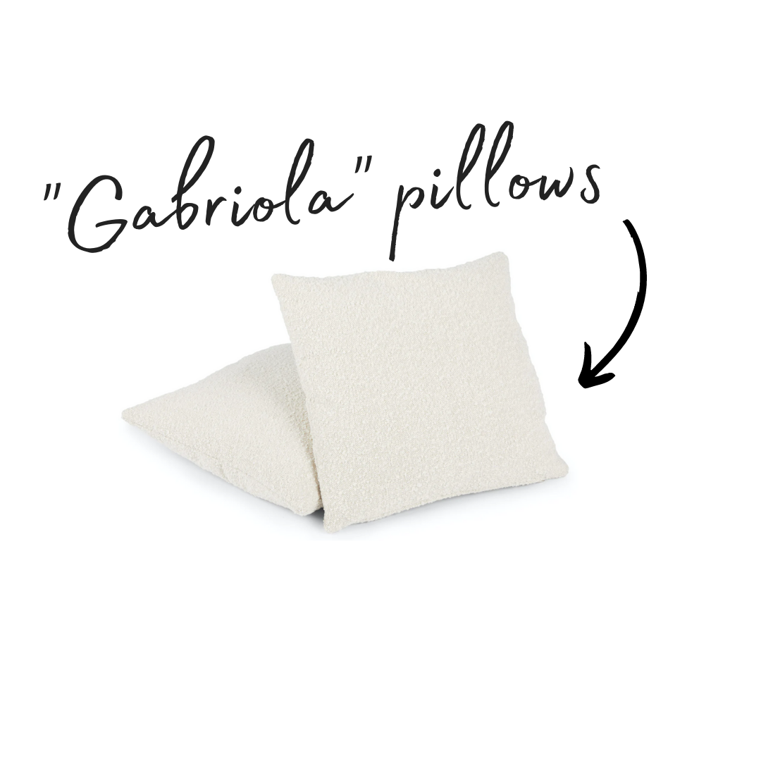
The question for any person who “cares not” for design always asks: why do you need so many pillows on your couch? The answer my dear design-ridden friend: PILLOWS MAKE THE WORLD GO ROUND… or they certainly make the world a comfier place. Pillows are the place you get to have fun with style and go bold or textured. At times, it almost feels like the clothing to any room. Without them, your space just looks naked! The Gabriola Pillow set in Ivory was the perfect addition to my living room. They are woven from yarn with a looped curly ply and I just love the texture on these. So cozy and warm and it’s down-filled nature made it plump up so fast. Such a lovely contrast colour on the couch!
I also paired these pillows with two, two-toned black and white down pillows to give the couch a little extra comfort and visual interest. These were sourced from HomeSense, which is basically a lost cause for advice to anyone if you like them. It’s more like a good hand on the shoulder and a swell “GOOD LUCK, DEAR CHAP! Hope you find them too”.
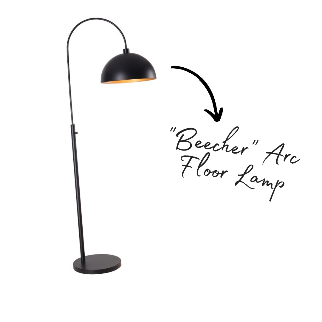
Stylish lighting in a room is like the high-heel shoe to an outfit. The room will look good without but it certainly completes the “outfit” if you know what I mean? I wanted something industrial but modern and featured an arch that could drape over my sectional couch. I had my eyes set on some pretty expensive options but opted to go a little more affordable and found this light called the Beecher Arc Floor Lamp from Wayfair. I still think it looks pretty snazzy though?!
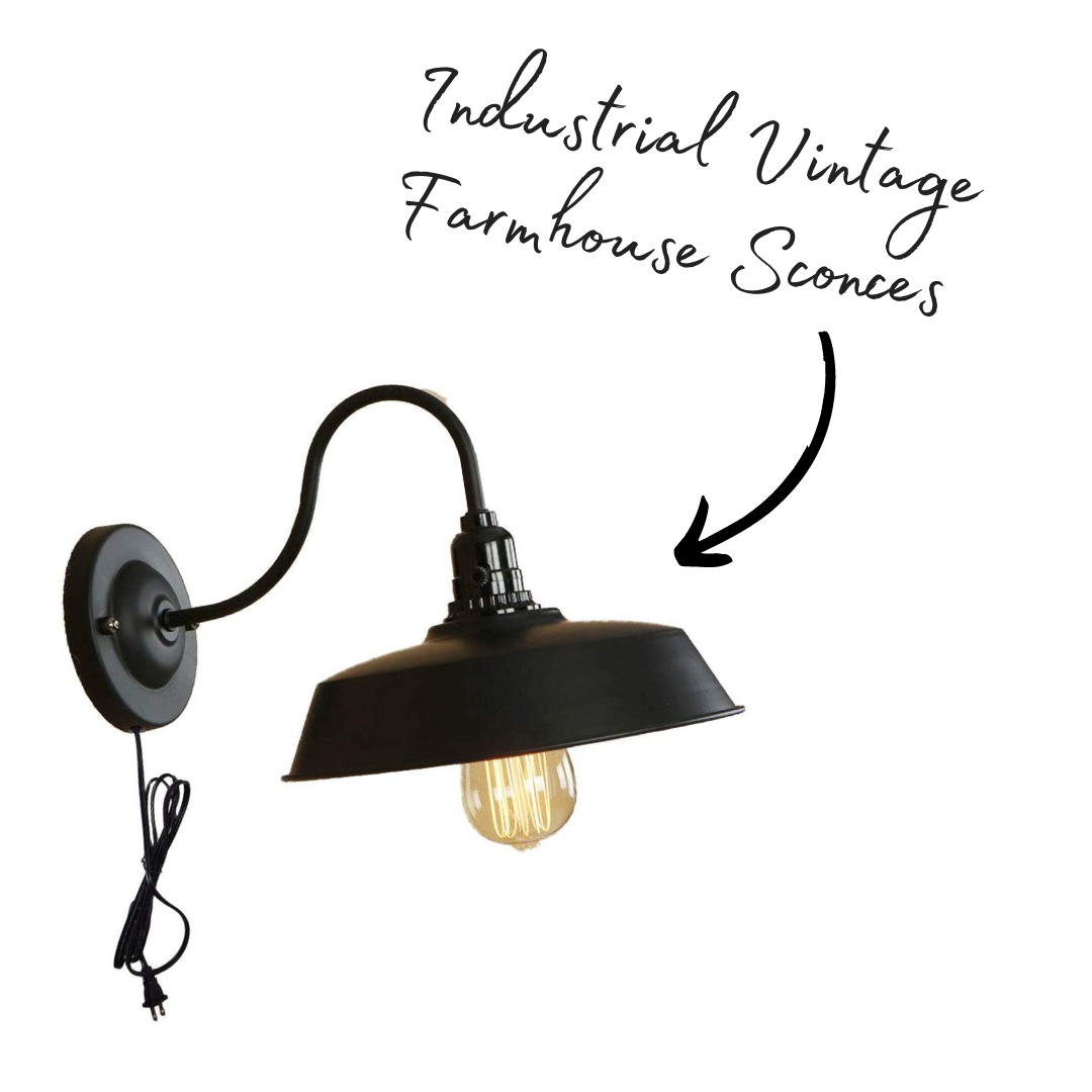
The last lighting element worth talking about were these cool industrial vintage farmhouse sconces from Amazon. A total steal for price and they looked amazing overtop of two diy shelving units. Paired with a stylish vintage bulb, these bad-boys really gave the space a true farmhouse feel.
What is the most pretentious thing I can say here… Um **cough**ART IS LIFE, BRO. Just kidding but I do love art. In the past, I’ve always gone the route of… MORE IS MORE but this time, I wanted the space to breath. I needed to breath so I opted to choose ONE piece of art that I loved and make that the centerpiece to the room. I’ve always loved this Matisse trend everyone has been on. I’m jumped on that train so fast and I couldn’t be happier that I did. This art piece looked so beautiful in my living room and brings me so much joy, everytime I look at it. Isn’t that what art is about? Joy?


