MY MODERN FARMHOUSE OFFICE MAKEOVER
This office makeover was such a HUGE milestone for me! I say this all the time but I’m constantly in awe towards the power of DIY & Design, what it can accomplish and how it can make you feel when it’s done. When I first moved into this home, I knew my focus had to be in other spaces , so naturally this office space fell to the waste side (even though I worked in this room the most). I planned it for months, making sure every detail was perfect and I love the outcome. This office space is truly a dream come true and I hope you find inspiration in it too!
SHOP THE ENTIRE OFFICE BELOW!
“I think of my home as one big novel. Each room represents a new chapter, a new journey and a new character that builds and evolves the overall storyline. Although each room feels different from the rest, you can feel the cohesive story throughout. It’s a magical feeling to build each chapter and see the growth of my home. As each chapter finishes, a new one is written. Perhaps one day I’ll close this book to write a new one, but for now…I’ll keep on writing.”
- DIY DANIE
THE BEGINNING OF THIS CHAPTER STARTED IN A grey, DRABBY PLACE….
I’m not going to lie…before this makeover, this office space was 100% function over fashion. I called it the “dumping room” because it was the space we dumped EVERYTHING that was out of place in our home. A Random box? OFFICE. Rolled up rug we aren’t using? OFFICE. Old plant pots? OFFICE - I think you get the point. Obviously, this room was last on our priority list when it came to tackling our home but I used this space so much (literally 7 days a week) that I knew I couldn’t wait another minute. Ok, i mean it could have been worse… Regardless of the broken ceiling fan, drabby grey walls - it had a desk, some storage, a few plants and a great window to let in the light.
Although I have this need to get everything re-designed right away, I think waiting to makeover over this room had a positive impact on the design. Spending as much time in this space as I did provided me with perspective on what this room really needed and didn’t need!
I knew I wanted storage (lots of it), shelving for all my plants and books, a good working desk that had access on both sides for two work spaces and a comfy sitting area for brainstorming and research (aka flipping through my fav home decor magazines).
Beyond all that, It was about having fun with the design and rethinking how to look at space in a new way. I always challenge myself to thinking outside the box and try NOT to come up with a design where all the furniture pieces are glued to a wall. As you can see in this before, all the elements were places in a U shape around the room. This is a big NO NO to me. Look at all the untapped space in the middle! Think about how you can use that in a functional way to make the space come alive!
BRING IT ALL DOWN!
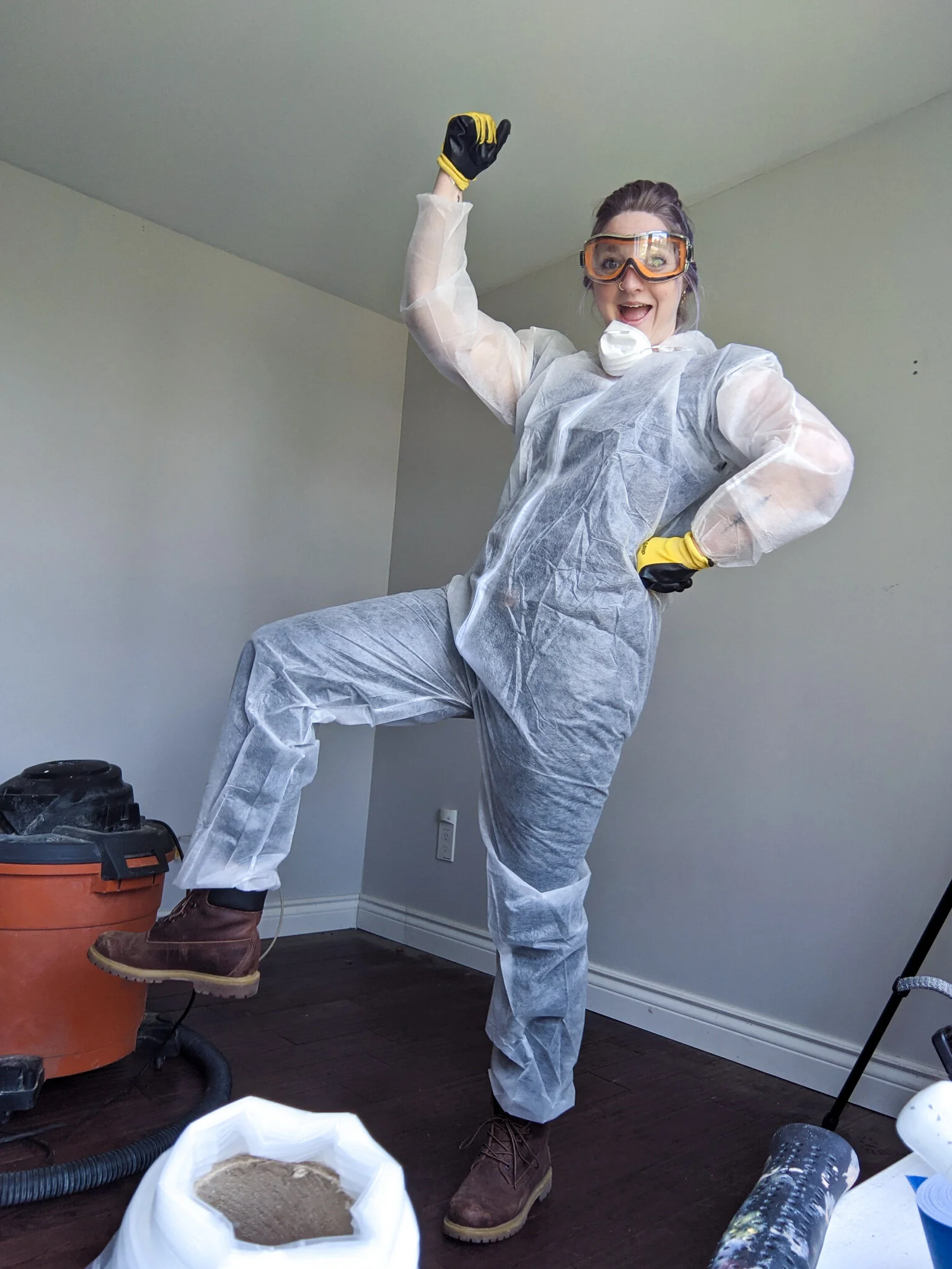
Before any of the design could take place, I first suited up and journeyed back into the depths of mordor to remove the ceiling and expose those beautiful old farmhouse joists and beams that lived just beyond the black gates. I basically felt like a superhero, but that’s just me.
This is where the real magic begins.
THE MOOD BOARD
WANT A CLOSER LOOK? CLICK HERE TO ACCESS MY FULL MOOD BOARD!
THE BOOKSHELF DESIGN
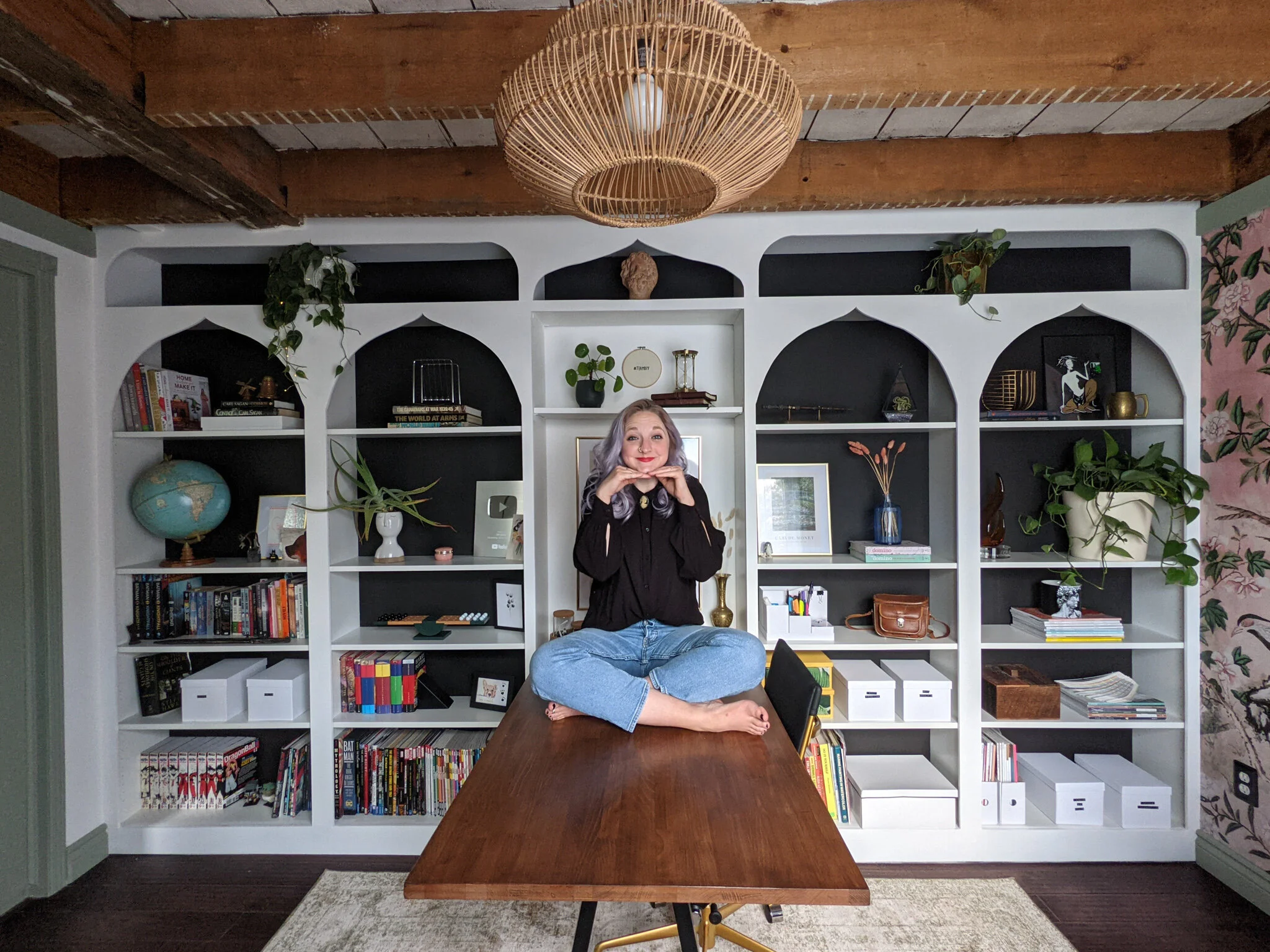
I always had a vision for these bookshelves from the beginning. Starting with 4 of the famous IKEA billy bookshelves, I transformed and hacked these shelves into the built-in bookcase of my dreams. It took 3 full days to accomplish but every moment of it was worth it.
I loved the idea of evolving the famous “arch” into something more visually interesting. I knew I wanted to design the fronts taking inspiration from beautiful Moroccan doors that featured a more “cathedral” type point at the top. I have a feeling many of you will see something different in this design - Whether that's a more spiritual element or perhaps just an eastern inspired design element or even a nerdy fantasy-esque design! Either way, I love that it’s open to interpretation and ultimately it looked so beautiful in my office space.
THE FINAL DESIGN
SHOP THE LOOK!
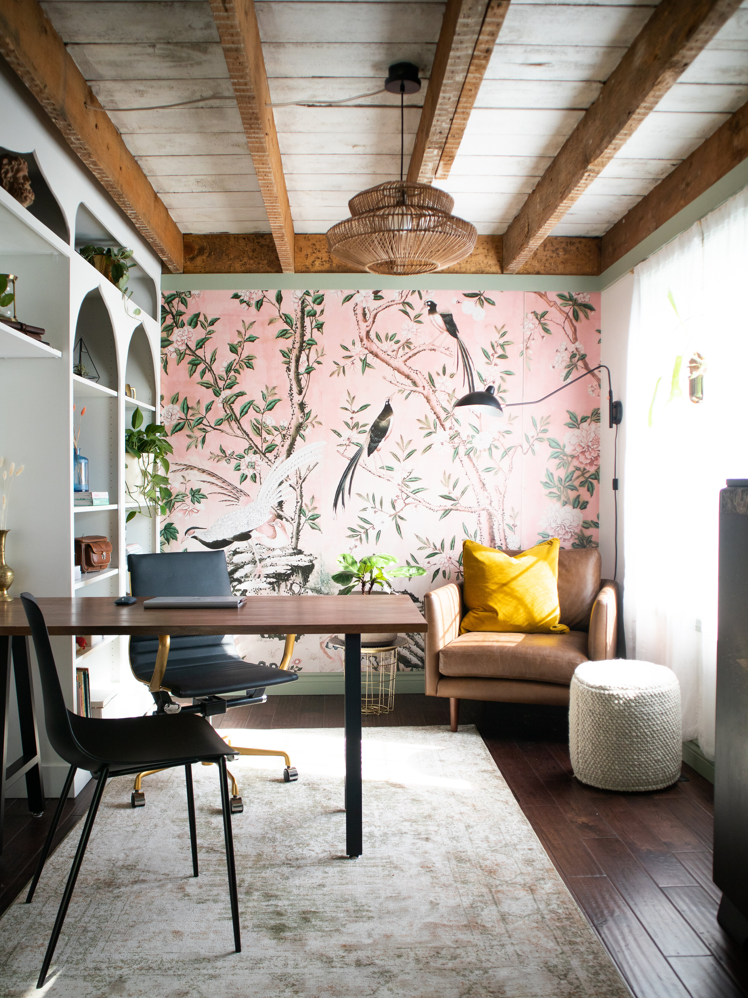
This stunning retro inspired magnolia chinoiserie wallpaper was the perfect accent wall in my office. I found wallpaper on etsy from a store called Anewall Decor. They were amazing to work with and custom fit the design to my wall. They have tons of different designs from large murals, contemporary prints & Tapestries! Check them out.
This is a non-skid laminated rug pad made from 100% recycled synthetic fibers from Rugs USA. I have learned to always get a rug pad when you first buy a rug - it’s going to first and foremost keep your rug in place but they also extend the life and condition of your rug and they protect your floor!
This 5x8 beauty is called the Sage Faded Imperial Medallion Area Rug. I ordered this from Rugs USA along with the rug pad and it was the perfect rug to anchor the entire room. I can never get over the affordability of their rugs - such good quality and so comfortable on the feet. I just love the faded worn look and of course it’s sage… so you know...I had a theme going here - if you haven't guessed!
This beautiful piece of art was called the Suru Pendant Lamp in small from Article. It has a beautiful rattan weave on a metal frame and I love simply love the curvy shape of it. Reminds me of a beautiful curvy woman. Obsessed with the light and obsessed with how it looked in my office space.
This was the Burrard Bella Tan Chair. Friends, this chair is perfection. It actually comes in two colours - tan (like this one) and a caramel colour. When I saw it, I just fell in love. It has these beautiful clean lines, slender arms, wood tapered legs, deep set seats so you can really cozy in and that leather is just buttery smooth. I’ve never relaxed in a chair this comfortable and it made the perfect corner seating area for my space.
Let me introduce the beautiful Lucca Pillow in the colour Yarrow Gold. It’s made from plush velvet with a nice piped edge detail. It’s down-filled and it’s just so stylish looking. This actually comes in 8 different colours but I went with Yarrow gold because I wanted something striking to offset all the greens and pinks in the space and this pop of yellow was just the thing to do it.
I wanted something above the chair for reading and when I saw this Article Leap Black Sconce Lamp, I knew this was it. First and foremost, I loved how the shape of the lamp complimented and almost felt like an extension of the birds on the accent mural wall. Second to that, I’m a girl who loves a good copper detail in my home and this lamp had these lovely copper finishes that make me sing on the inside with joy. The shade is completely adjustable and it’s just a beautiful mid-century inspired light.
I am a person who loves to kick their feet up when I’m working so having something to help orchestrate this comfortable notion was important to me. This beautiful Article decor specimen was called the Texa Pouf in the colour Vanilla Ivory. It’s made with hand-woven wool tightly looped and it’s so great as additional seating or in front of the chair or under the desk. Really it’s just a multi-faceted piece for the space. It comes in two colour options - Vanilla Ivory and Fog Grey. Very beautiful!
I added the Svelti Pure Black Dining Chair from Article. I loved how this chair was more low key but it was super comfortable to sit in. When it wasn’t being used I could tuck it in on the wall beside the magical star cabinet. But for a chair it’s very sexy. It has a mid-century looking vibe with a nice modern twist. Thin metal tapered legs. It’s just so sleek.
I found this chair on sale from wayfair - it was called the Low Back Faux- Leather Office Chair with Iron Frame. It had lumbar support, a comfortable cushion, tilt lock & wheels - but my fav feature was the handlebar at the back. I like that you can hang a blanket from it... Sometimes, it’s the small things.
To make my built-in wall I purchased 4 IKEA Billy bookcases for $55 each! We painted the backs black and attached them to the wall using the included IKEA wall brackets.
This Gerton tabletop is from IKEA and I’ve had it for years now - I still love it! Over the years, It had seen some wear and tear so I gave it some love and stained it in Dark Walnut gel stain to match my new office space!
Also, check out the gorgeous artwork I added to the space from Desenio!


